
5 Easy Ways to Make your Site Better
Developer Kishya Greer details a few simple ways to make your site stand out from the crowd.
It seems that everyone has a website. They’re as easy to make as a batch of cookies. Heck, your mom’s dog groomer probably has one. It’s a necessity. Now, does everyone have a great site? Not by a long shot. With Squarespace, you can create a great web presence in no time — but you want to make sure it stands out from the crowd.
Here are 5 ways to make sure your site is better than your competition. Or at the very least, these tricks with make sure you stay off a Worst Websites on the Web blog post. Yikes!
1) A simple visual brand
Branding is a scary and expensive word, but don’t worry — we’ll make sure this is easy for anyone. You may not have a logo, but to have a solid web presence you just need consistency. Here are the basics every great site should have.
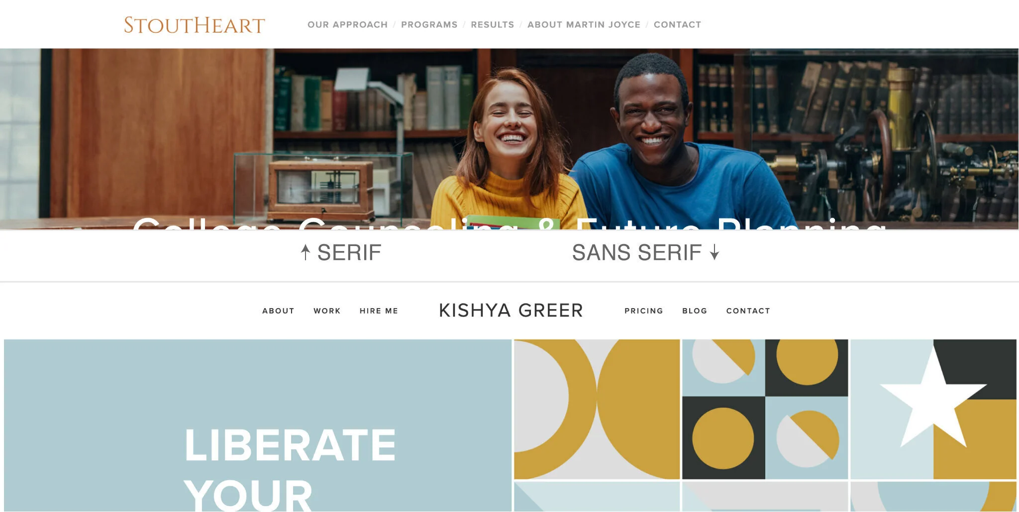
*A logo
If you have one, use it. If not, choose a font that works and simply type it into your site. A serif font gives a stable and sturdy vibe. Sans serif gives a modern feel, while a script can feel handmade. Chose one that fits what you are trying to convey.
*A solid color palette with about five colors
The legibility of your content should always be your top concern, but that doesn’t mean you can’t use color. Using a tool like Coolors.co to generate a palette can ensure colors place nicely together. Use the most vivid color in your palette for your buttons.
Coolors tip: Pick one color in the tool and lock it. Press the space bar until you find other colors you love. Locking them along the way will create something unique.
*A great font...or two
If this is not your strong suit, I suggest using the font combinations available in Squarespace. Since Squarespace uses Google fonts, you can then download them on your computer and use them on other things outside of your site. Yay, consistency!
2) Fun-sized content
Leaving something to the imagination creates curiosity. You may have a lot to share on your site, but doing your best to create small, bite-sized sections will make sure people actually read it. Let visitors know what you do in as few words as possible. Turn long paragraphs into a list. Make it easy for people to figure things out. If you want to get into the details, try creating a hidden page or a PDF to download. You could create a form to collect names and emails to start a conversation, too — it’s a great way to create leads!
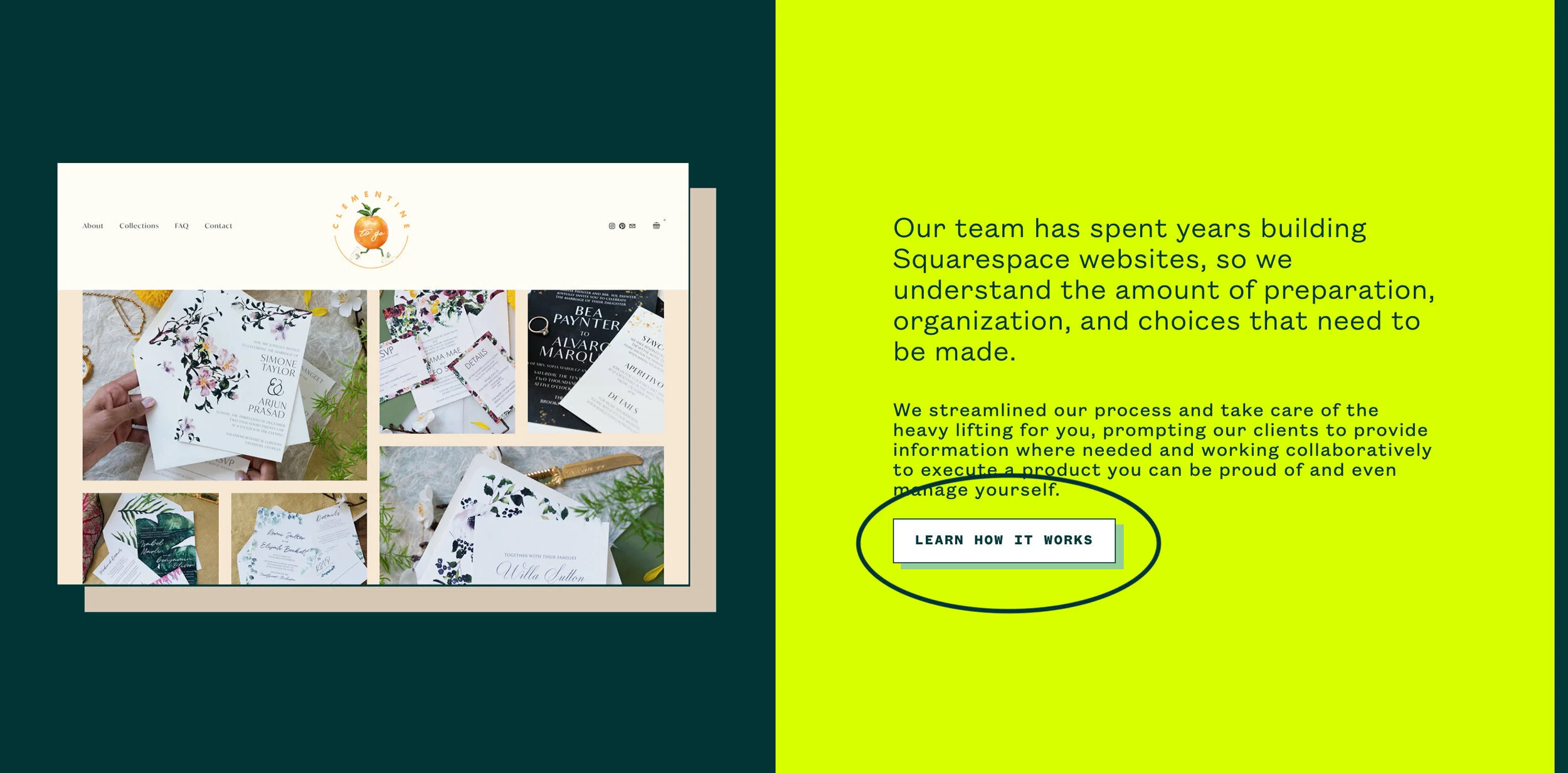
3) Don’t forget the CTA (call to action)!
Sites often share info, but forget to ask for action. What do you want visitors to do on your site? How can they get involved? How do they contact you? A great way to include a CTA is to marry it with relevant content. Have a section on your page about events? Add a Get Involved button, or a Sign Up for Event Updates form for your email list.
Making things easy for people while the subject is on their minds will always be your best bet. On the other hand, CTAs can also be annoying, so be sure to balance out the amount you have per page.
4) Tell a story in your navigation
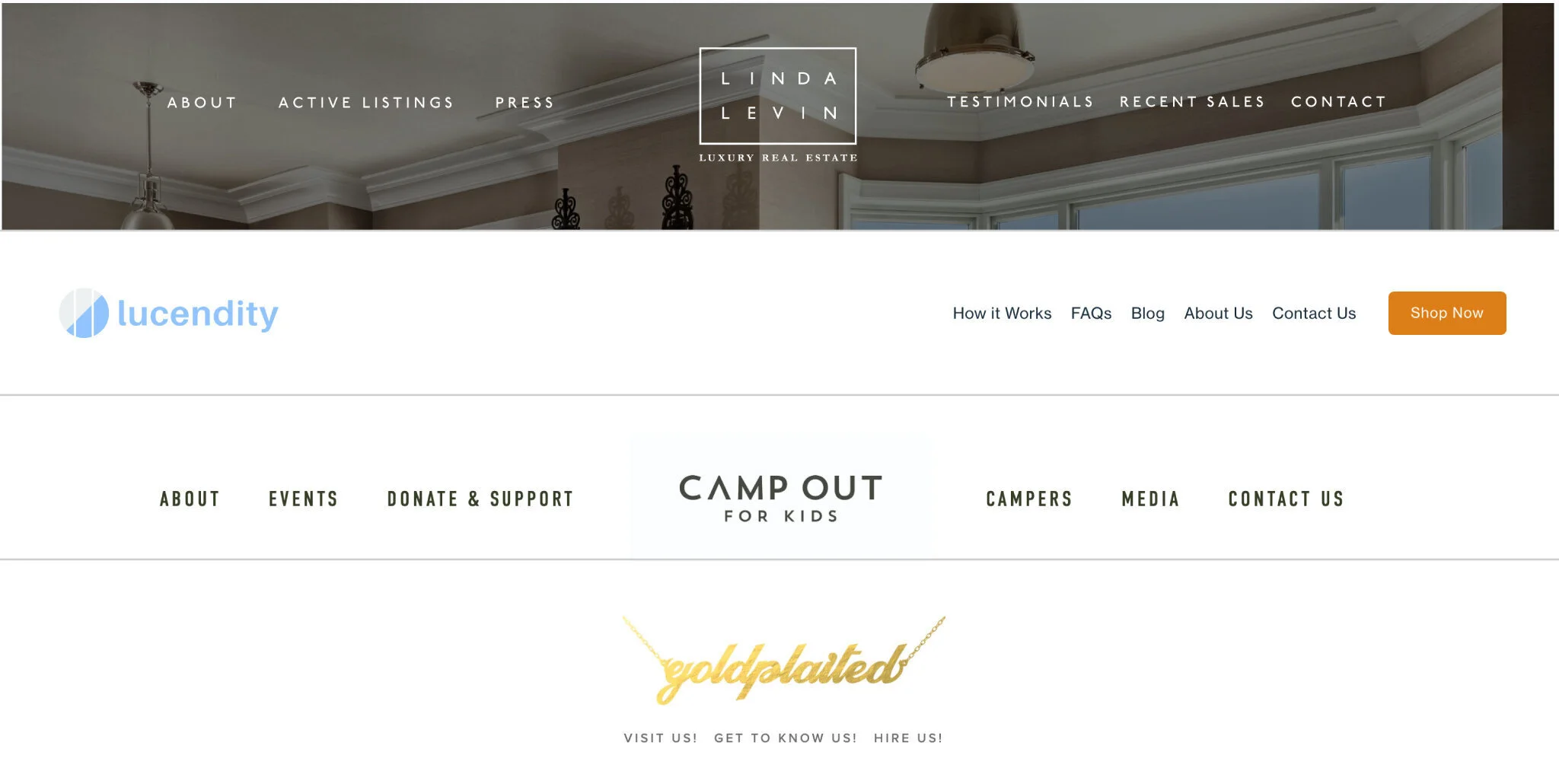
Navigation leads site visitors on a journey — and you have some control over it. Label each section, and make the labels short. Do you really need “us” on Contact Us or About Us? Less is more. Think of it like a mixtape — yes, a mixtape. Tell a story about who you are with the order your navigation is presented, and visitors may just fall in love ... I mean, contact you. If you are a restaurant, your first nav button may be Menu. A lawyer may have Services. The first spot sets the stage for what you think is most important. About doesn’t always have to be first.
Tip: Skip the Home button in your nav. Most users know to click on your logo or name to take them back home. The only exception is if you have a splash or cover page.
5) Tinkering under the hood
Squarespace has some great building features that most users don’t use. Be sure to poke around and discover how these tools can help do some heavy lifting. When you see a gear icon, I recommend you click it. There may be settings you didn’t know existed. If you think you “broke” something, simply discard changes — no harm done. You have more control than youthink . Here are a few places to start.

*Add alt text to images (pictured right)
Adding more keywords anywhere always helps with SEO, and most importantly, it increases accessibility for visitors. Help screen readers!
*Add tags and categories to a blog post
Adding tags and categories can help you filter content for readers. One example is adding a year as a tag; then you can filter by the year posted with a summary block on any page.
*Add your location and site description
In the same place you add your logo or your business name, there’s a space to add your location. Including this will help you show up in searches in your area. A site description in this same section is also a great place to add keywords — this short description shows as a summmary when your site appears in the search.
A great site is achievable, and with these tips, you can outshine the competition. Remember, a great site can take time if you are going at it alone. Not everything needs to be done on day one. You will always improve your site, it will always be a work in progress. The beauty is that is now you have some tips to create a solid foundation. You got this!
— Kishya Greer, developer