
In Process: Canvas Real Estate
How a Squarespace website redesign accurately conveys what this Chicago-based business does and what makes them stand out.


The old home page scroll
Canvas Real Estate is an elevated real estate advisory that drives community enhancement by building relationships between tenants and landlords.
They came to us seeking a reboot of their current site. They were looking for something that spoke to who they are exactly and what they do and had some specifics that they wanted to change.
Some things they didn’t like about their existing site included:
The color palette, fonts and aesthetics
The over-explanation of what they do, and too many “fancy words”
The formality of it
The overall layout of it
The landing page especially — they were not happy with it’s design at all

The old contact page gives you an idea of the lack of design that went into the original site. The color is dull, the text is somewhat difficult to read, and there are no images to highlight what they do or who they are.
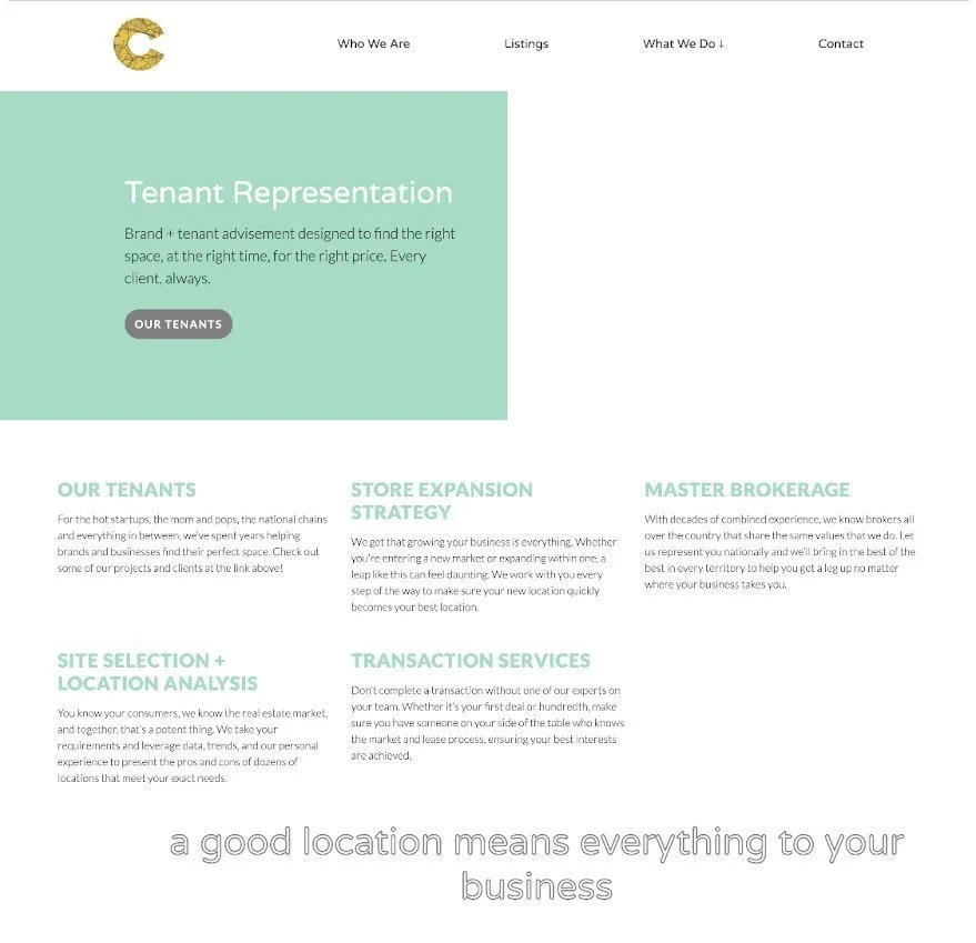
This page, highlighting all the services they provide, misses all the marks. There’s no imagery to show prospective clients their previous work or how they bring about results, and the layout of the page is awkward with no real cohesiveness from top to bottom.
Here’s how we’re working to give Canvas Real Estate the site to best represent their brand.
Creating an entirely new color palette based on the tried-and-true base of black and white
Bringing in beautiful imagery provided by the client to show off what they do and how they do it
“Dumbing down” the text to ensure that nothing is too complicated and it’s all easy to understand
Highlighting who they work with from both the tenant and landlord sides
Simplifying the process of what they do to make it as easy as possible for prospective clients

We see immediate improvement here with the Landlord Partners page. The redesign in black and white with bold text helps ensure that everything is crisp, clean and easy to read. This also gets right to the point and lets the page speak for itself.
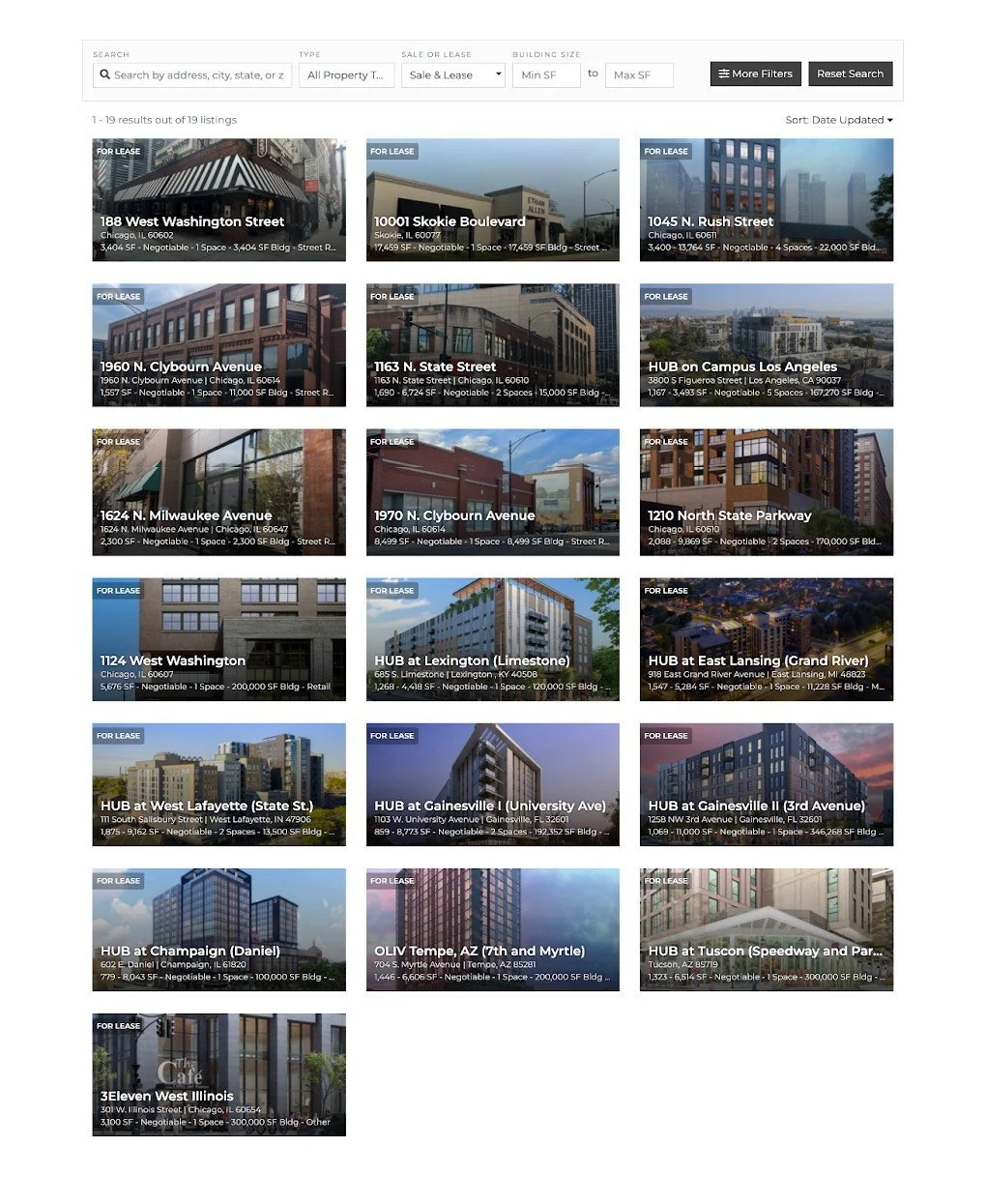
The new Listings page has incorporated a Universal Filter to help narrow down options for prospective clients based on need. Again, we get straight to the point by showing what’s available and encouraging users to interact with this page via the filter to customize their experience.
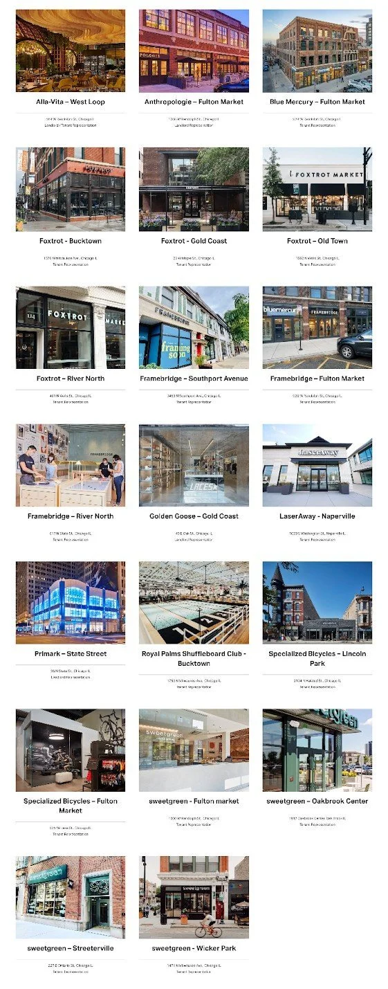
The new Portfolio page really speaks directly to who Canvas Real Estate really is and what they do — the whole point of the redesign. We use beautiful imagery to highlight current landlords/tenants and share a bit of info about each. This allows prospective clients to see what’s possible when you partner with Canvas.

The new homepage really speaks for itself. You can see firsthand the vast improvement over the old homepage above. We’ve established all the important things right here: who Canvas Real Estate is, what they do, with whom they are working or have worked, and how to get in touch with them.
We also see the difference that bringing in a client’s own personal, eye-catching imagery can make when it comes to redesigning their website, and how balancing out images down a page really helps with the cohesiveness of the content.
This redesign is simple and elegant and just what the client wanted. Take a look at the whole picture here!